Invengene
Case study
↓

Project Overview
Invengene needed to be more than another injectables manufacturer competing on the same functional promises of quality, affordability, and delivery. In a high-barrier category where most brands looked and sounded alike, the opportunity was to shift its role from provider to partner, combining R&D strength with operational precision to help clients unlock growth, not just deliver a product.
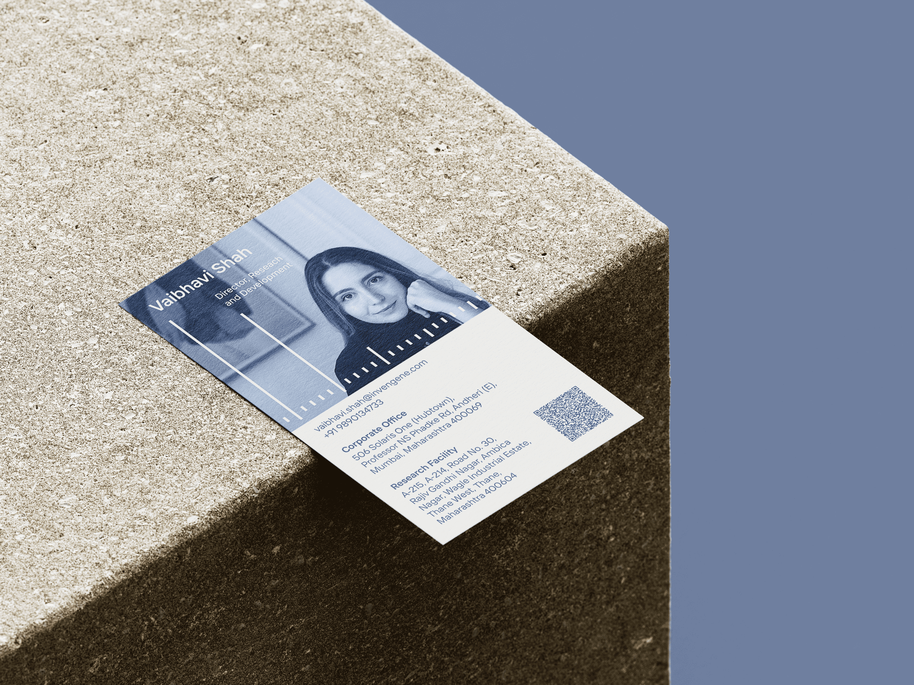
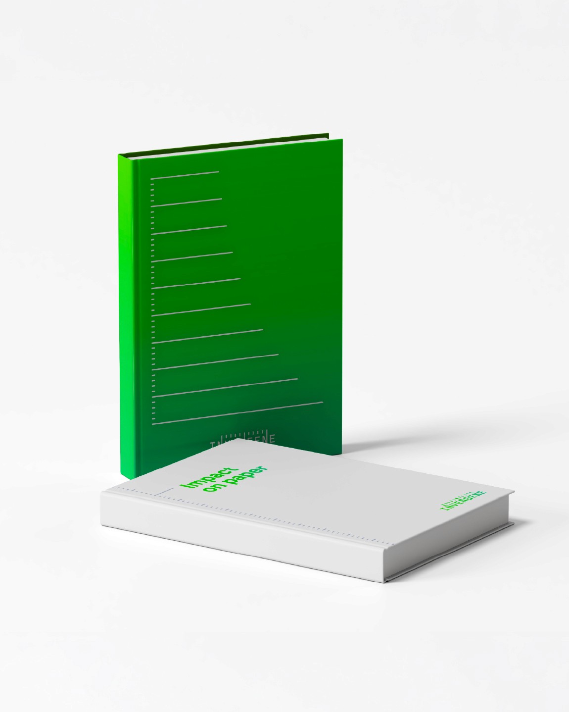
The identity is rooted in the personality of an orchestrator: bringing together scientific expertise, operational precision, and the ambitions of its clients. At its core is CalMarks, a graphic device inspired by the calibration marks on a syringe. Their precision represents reliability, while their fluid, endless nature brings agility to the system. This balance is reinforced by a modern electric green gradient, Fluid Green, set against the muted greys traditionally associated with the category.
The name itself revealed another opportunity for the wordmark. The three Ns, spaced at equal intervals, created a built-in rhythm that became the basis for a distinctive wordmark fusing the name with the CalMarks device. The result is a brand that brings precision and energy to a category defined by functional sameness, making Invengene feel less like a manufacturer and more like a partner built around its clients’ ambitions.
Client
Invengene
Year
2024
Team
Landor